In 1992 I was heavily pregnant with my son, when my husband took me away for a pre-'our-life-is-about-to-change-forever' holiday! We went to the Dordogne area of France (we were living in the UK at the time!!) and whilst there saw the wonderous caves of Lascaux. Well....the reproduction of the caves! Even there we werent allowed to take photographs, so I am grateful to have a few precious postcards to remember the visual impact of those cave paintings! I was smitten with these paintings created by ancient hands & reaching across centuries to me! An interest in cave art had begun!!
On a more recent family holiday, to the South Island of New Zealand, we went on quite a trek to see these Maori cave paintings.
And here, on my most recent holiday, someone has left their mark on Lord Howe Island!
For this body of work, I wanted to represent mankind's marks in a landscape, in such a way that they looked natural together. The working title for this series of pieces became 'Pictoglyphs'. However, it SHOULD have been 'Pictographs'!!! Petroglyphs are rock carvings, whereas Pictographs are pictorial symbols or signs! (Always good to learn something new!!)
It occurred to me that the record I had been keeping of the 'short & curly' shapes, would be a perfect source for my pictographs. I looked through them all & made a small collection of possibilities.
In terms of style of presentation, I wanted to try a different abstract approach & was very interested in the design formats of work produced by textile artists; Dorothy Caldwell, Fenella Davis & Alice Van der Veleen. The only way to learn was to study their work, so I took notes, analyzing how they structured their compositions. During this process, I confirmed to myself that I wanted to have patches again, but in a less structured way than I had used before. Aside from patches representing tiles, I also see them representing a moment in time...a memory,...a snapshot of what is seen and experienced.
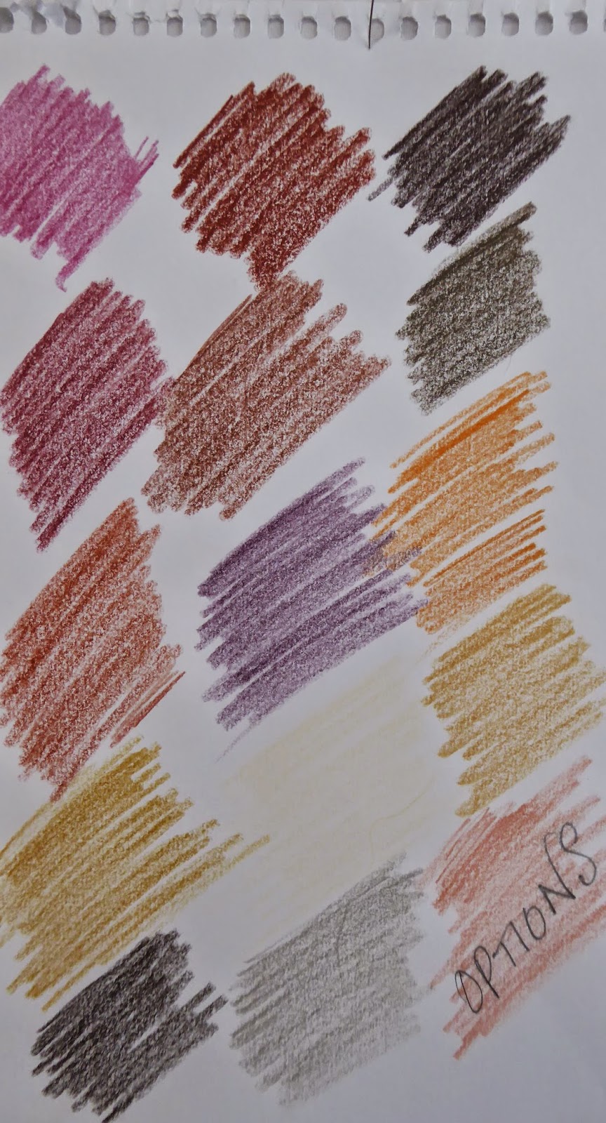
At the same time I was reading Sybella Court's book 'Gypsy'. Her practice is to create a colour palette of 10 colours that represents the 'feel' of the place she is inspired by. So....I got together as many photos from magazines that I could find, of the type of landscape I wanted to represent...
...and came up with a lot more than 10 colours! Pruning away a few of them, I was left with a colour palette I was happy with. The idea being that not every piece would have all the colours, but that there would be 10 represented across the whole body of work. Ideally, that would mean a sense of harmony!!!
It was time to start experimenting & playing around with ideas. For me, sample making is as important to the process of producing new work, as drawing is.
For this body of work, I also prepared some hand painted fabric....in this case using solar printing.
As the designs were coming together, it soon began to be clear that there were two distinctive TYPES of pictograph styles I was producing. The first looked more like a letter or word from an unknown language...
...whereas the second was coming together more like I had hoped! What to do? Did I split them into two seperate bodies? Did I just leave them together & hope for the best! I knew I wanted to do a language based piece...would I be better to keep the more letter-like ones for that? All these questions were whirling away in my head when the answer came from an unexpected source.
I had just started reading Bruce Chatwin's book 'Songlines' , and on page 15 after describing the Aboriginal Creation Myths, he said;
"...each totemic ancestor, while travelling through the country was thought to have scattered a trail of words and musical notes along the line of his footprints, and these dreaming tracks lay over the land as ways of communication between the most far flung tribes."
He followed this up with suggesting that the land mass of Australia could be read as a musical score! How utterly BEAUTIFUL! It made sense of the variations in style within my body of work. The concept made such an impact on me that I decided to title it 'Singing The Land' instead of pictographs. Although I had many design possibilities, only 6 were created! Here they are...
*Please respect my ownership rights to the images used above. Thank you. :-)


No comments:
Post a Comment