Friday, 18 July 2014

Home is WHERE....?

My initial plan was to create three pieces for this body of work, representing the three family homes I have had; NZ where I grew up, England where my own family started & Australia where it has continued! The idea of using touristy teatowels as the background to my 'landscapes' seemed to flow quite naturally once the concept started blossoming in my mind.  It also appealed to my sense of humour!!!!  However....I didnt realise how difficult it would be to get hold of them!

  It was easy enough here in Adelaide...

 ... & my mother eventually found a couple of options in NZ, but my friends in the UK.....couldnt really find the tacky touristy type I was after!  Not so many people are washing dishes these days....and when they do buy teatowels on their travels, they now seem to choose nice designer ones!  I did buy a designer teatowel from the UK online....having noticed that on ebay the 'tacky' type were being flogged as 'vintage' & were ridiculous prices! However....with further thought, I decided against using the designer one for 2 reasons;
1) An artist had produced it & I could have a copyright issue on my hands!
2) The style really didnt go with the others!

At the same time that I was sourcing my background fabric....I was doing something a little bit unusual.  I was photographing my dishes!  One of my cameras has this really cool 'drawing' option & I found that particularly useful in capturing the shapes of my 'landscape'.

I  enjoyed the variation in shapes, height & texture.  Writing & pattern seemed to be more obvious in the black & white restriction of these 'drawings'.

  Because the teatowels were so bright & colourful, I chose to have my dishes predominantly white, with a few different textures & fabric types, with just one or two features picked out in colour.

 Wanting to have some link between the landscape & the background, I printed the photos of the teatowels onto fabric, & incorporated that as a fabric layer. In the photo above, you get a glimpse of the photo transfer in the mug behind the teacup!


Because that writing had been so significant to me in the studying of the photos, I chose to include writing somewhere on the dishes also.  I then took this further & started altering the teatowel background, by stitching in comments, memories and altering some of the images, including painting some of them a different colour. 

  Whilst creating these pieces, I was also thinking about what 'home' means & how it not only signifies the physical space we live in, but also the location.  At the time I was reading Eleanor Catton's masterpiece "The Luminaries" & she phrased it so beautifully when one of her characters said

"...if home cant be where you come from, then home is what you make of where you go."

I couldnt have worded it better myself!  And then Bruce Chatwin in "Songlines" made it even more personal by saying:

"One commonly held delusion is that men are the wanderers & women are the guardians of the hearth & home. This can, of course, be so.  But women, above all, are the guardians of continuity; if the hearth moves, they move with it."

 
Exhibited with the work 'The Rolling Plains Of Home #1 & 2', are my own penned lines;

                            Home
                                  is the nest
                             I choose to make
                                wherever I am
                             To lay my head
                                   to read a book
                                   to pour my tea
                              Whether for a day
                                              or a lifetime!

Thursday, 17 July 2014

Beauty in the KITCHEN


It was time to explore the potential for beauty in the kitchen! Hence...another mindmap!

Unlike a lot of modern Australian families...we DONT have a dishwasher!  Our kitchen is small & I opted for the practicality of more storage over the need for a big machine that washed, dried & polished!  Needless to say my children did not agree with my decision, especially when they were old enough to help wash & dry dishes themselves!

Having to wash & dry dishes means that there is no option but to really look at the marks that have been left behind as I am about to plunge the item into the water.  The chore is a tactile one....I become intimate with each curve & lip of each dish. In the stacking of clean dishes to be dried, I think about placement & in a quirky sort of way...composition!!!

The small body of work produced to represent this room of the home, concentrates on the landscape compositions created when stacking dishes, & the tea stains at the bottom of cups.


Wednesday, 16 July 2014

Illuminated!


It may seem strange to have a language inspired piece alongside a variety of 'natural environment' inspired pieces.  However, I believe language is very much a part of our 'natural environment'.  It is the tool we use to express & communicate what we see, hear, smell, taste, sense & feel. The physical representation of that language...writing... is in itself a wonderful landscape of lines, curves & dots that individuals throughout mankind's existance on this planet, have designed to mean something.

One of the great gifts of travel is to not only see the places where other people live, but also how they express themselves...their written language. The photo above is the NEW Library of Alexandria in Egypt, which I was privileged to visit in 2012.  The exterior is decorated with examples of language from all over the world. What struck me was that, not speaking any other language but English...I didnt know what most of those line & curve combinations meant, therefore I was able to appreciate them for their structure & beauty, instead of being caught up in their meaning!

It occured to me in my recording of 'short & curlies' that some of those combinations looked like they could form a written language!

So I started selecting a few of those combinations & started respecting them as potential 'words'....albeit meaningless words!!

It was time to do some more research! I started looking at Manuscripts & Illuminated Gospels, all things I find exciting and beautiful. I noted the layout, the style, where letters were bold & where they were muted.  I made notes on borders and backgrounds. Ideas started to form....


Returning to the sketchbook, I wondered how I was going to create a regular repeat pattern from irregular 'hair' designs! By using mirror image & repeat patterning ofcourse!  Eventually I had an arrangement of 'words', which I would surround with borders to create the effect of some form of forgotten manuscript!

Time to think about colours & fabric choices. Medieval manuscripts & Arabic texts have a richness to them that I want to bring to my work.  GOLD was a must!

By laying my designs out on the gold background, with sections coloured in, I could better see, which fabrics I wanted to go & where.

The borders were developed seperately, with a view to attaching them AFTER I had created the   script. They were completed first because it took me a LONNNNNNNNNG time to sort out  the order in which I wanted to place my words!

Then I needed to play with a few samples to see what colour & fabric combinations would work in the practicality of using contemporary reverse applique, to sew those words onto the background!

And what would work best alongside those borders?

LOTS of sewing, lots of cutting & then lots of handstitching later it all came together & here it is...

The working title throughout the development of the piece had been 'Illuminated'. However, I had a few other titles swimming around in my head, so I asked some friends for their preferences & they agreed to 'Manuscript of Hair & Now' as being the right title for this piece!!


*Please respect my ownership of the images & text above & do not copy without permission. Thank you


Tuesday, 15 July 2014

Pictoglyphs Of The Cleaning Cave

I'd escaped to the ocean's depths & the sky's heights, & I'd played around in the garden...it was time to explore the landscape!

In 1992 I was heavily pregnant with my son, when my husband took me away for a pre-'our-life-is-about-to-change-forever' holiday!  We went to the Dordogne area of France (we were living in the UK at the time!!) and whilst there saw the wonderous caves of Lascaux. Well....the reproduction of the caves! Even there we werent allowed to take photographs, so I am grateful to have a few precious postcards to remember the visual impact of those cave paintings! I was smitten with these paintings created by ancient hands & reaching across centuries to me! An interest in cave art had begun!!

On a more recent family holiday, to the South Island of New Zealand, we went on quite a trek to see these Maori cave paintings.

And here, on my most recent holiday, someone has left their mark on Lord Howe Island!

For this body of work, I wanted to represent mankind's marks in a landscape, in such a way that they looked natural together.  The working title for this series of pieces became 'Pictoglyphs'.  However, it SHOULD have been 'Pictographs'!!!  Petroglyphs are rock carvings, whereas Pictographs are pictorial symbols or signs! (Always good to learn something new!!)

It occurred to me that the record I had been keeping of the 'short & curly' shapes, would be a perfect source for my pictographs. I looked through them all & made a small collection of possibilities.

In terms of style of presentation, I wanted to try a different abstract approach & was very interested in the design formats of work produced by textile artists; Dorothy Caldwell, Fenella Davis & Alice Van der Veleen. The only way to learn was to study their work, so I took notes, analyzing how they structured their compositions. During this process, I confirmed to myself that I wanted to have patches again, but in a less structured way than I had used before. Aside from patches representing tiles, I also see them representing a moment in time...a memory,...a snapshot of what is seen and experienced. 
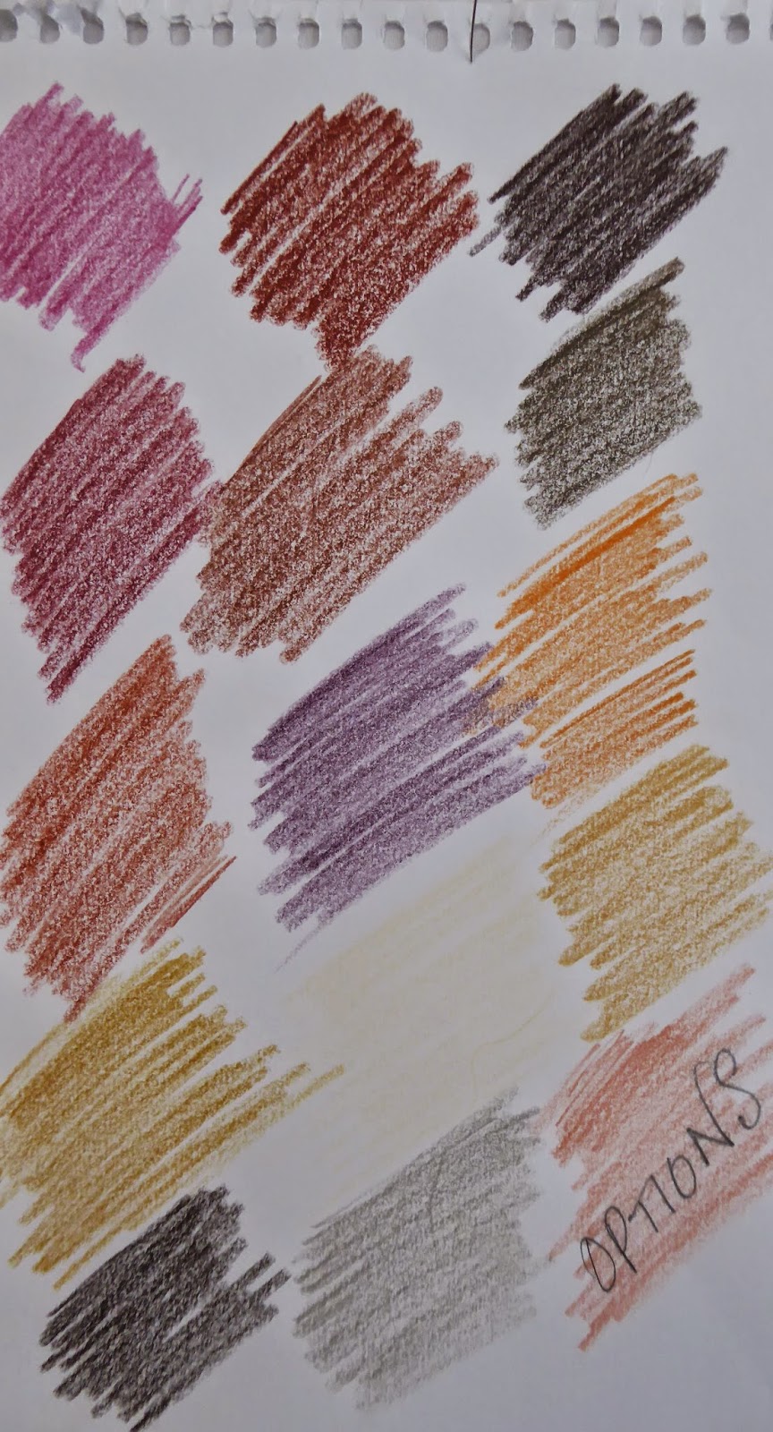
At the same time I was reading Sybella Court's book 'Gypsy'.  Her practice is to create a colour palette of 10 colours that represents the 'feel' of the place she is inspired by. So....I got together as many photos from magazines that I could find, of the type of landscape I wanted to represent...
...and came up with a lot more than 10 colours! Pruning away a few of them, I was left with a colour palette I was happy with.  The idea being that not every piece would have all the colours, but that there would be 10 represented across the whole body of work. Ideally, that would mean a sense of harmony!!!


It was time to start experimenting & playing around with ideas. For me, sample making is as important to the process of producing new work, as drawing is.

For this body of work, I also prepared some hand painted fabric....in this case using solar printing. 

As the designs were coming together, it soon began to be clear that there were two distinctive TYPES of pictograph styles I was producing. The first looked more like a letter or word from an unknown language...

...whereas the second was coming together more like I had hoped! What to do?  Did I split them into two seperate bodies? Did I just leave them together & hope for the best!  I knew I wanted to do a language based piece...would I be better to keep the more letter-like ones for that? All these questions were whirling away in my head when the answer came from an unexpected source. 

I had just started reading Bruce Chatwin's book 'Songlines' , and on page 15 after describing the Aboriginal Creation Myths, he said;

"...each totemic ancestor, while travelling through the country was thought to have scattered a trail of words and musical notes along the line of his footprints, and these dreaming tracks lay over the land as ways of communication between the most far flung tribes."

  He followed this up with suggesting that the land mass of Australia could be read as a musical score! How utterly BEAUTIFUL! It made sense of the variations in style within my body of work.  The concept made such an impact on me that I decided to title it 'Singing The Land' instead of pictographs.  Although I had many design possibilities, only 6 were created!  Here they are...


*Please respect my ownership rights to the images used above. Thank you. :-) 


Monday, 14 July 2014

Up in The Clouds

Having just dived into the depths of the ocean with my last piece, it seemed only fitting to soar high into the sky with my next creative endeavour!

I'm sure I'm not the only person who has looked up into that wonderful expanse of blue & just wanted to float on up there with the clouds!

Just as I'd found hair shapes from which I could conjure up jelly-fish forms, so too, did I find shapes that lent themselves to being human-like forms...dancers....or in this case a Harpist! As shown in previous blog posts, I developed each form until it worked for me.

I worked up some sample patches of strips of sky blue fabric, and then photocopied them together to see how it would look as a background.  On to this I drew a few of my designs & thought they looked GREAT as black outlines against the blue....but how would they look as WHITE against such a busy background?

Using contemporary reverse applique I created a sample piece to see whether my ideas would work.  I was VERY disappointed with the results!  In my head it looked so much better!  A friend pointed out that perhaps if I had the stronger white's against the lighter colours & the softer whites against the stronger blues...it might work better! Excellent suggestion...I put it in the creative crockpot of my mind & proceeded to develop my background instead!

Instead of patches made up of strips of fabric, I would have the strips go across the the width, visually broadening what would be another narrow piece of work.  Instead of machine stitching over the top of all those strips, I chose to kantha stitch instead. Labour intensive but the results were worth the struggle...look at the texture those stitches create!  Here's a close up...

Onto this pleasing background I started to pin my shapes, working out how many to include &  where to locate them.

Eventually I cut the number down to only three, keeping it simple (a cloud, a harp playing musician & a dancer) thus allowing the viewer plenty of visual access to the background.

I started by applying the 'cloud' shaped contemporary reverse applique 'sandwich' to the bottom section. Sadly it just did NOT work for me.   It is very seldom that I will unpick contemporary reverse applique, but I did on this occasion. It was time for a complete rethink of how I wanted the cloud, musician & dancer to look on this piece!

This is how I re-did the cloud & I am so much happier with it.

With the Dancer & the Harpist above, this made a very harmonious trio. Below is the end result, which I entitled 'Dancing With The Clouds' &  the short poem with which it belongs...


                                                If I could
                                                    I would
                                                Fly  and
                                                Float  and
                                                Twirl  and
                                                           take GIANT leaps
                                                 Of weightlessness
                                                           to DANCE
                                                           in the sky
                                                  With YOU
                                                                   Clouds.


*Please respect my ownership of the images above.