Sunday, 13 July 2014

Under The Sea

I love being in water, whether it be the sea or the shower! I particularly enjoy that sensation when I submerge myself fully in the ocean & the sound of the outside world is immediately drowned out & all I can hear is the waves & my heartbeat.  For me, that is a very relaxing & calming experience. (If only I could hold my breath for longer!!!) So when some of my 'hair harvesting' produced shapes that could be interpreted as jellyfish-like forms....it was only natural that I develop a sea inspired piece!

For many MANY years I have had this scrap of paper in my 'resources/inspiration' folder. It is a piece by Spanish artist Joan Miro. I kept it not only because I liked it, but  because I could see the potential for using contemporary reverse applique to produce something in this style. I loved the irregular patched background with the simple formed motifs in the foreground. Quirky & intriguing! This work became an inspiration for my 'sea' piece!


In my workbook I developed the shapes that I was particularly interested in using. (This shows the development of one of those shapes.)

I then cut them out & started playing with them....moving them into various compositions to see how they looked with each other. 

I tried variations with some of the forms and then others...


I tried various sized  options...
At the same time I started playing with colour options (this is where a printer/photocopier is a very convenient tool!)
I was also thinking about what was happening BEHIND the forms. My initial idea was to have the background as patches of white fabric, as I had done for the Plantaria series, again referencing white bathroom tiles.  However, when I came to start this piece of work, I was so SICK of white that I decided I needed to have a coloured background... for my own sanity!!!!

I started playing with ideas...

...and even more ideas!!

Eventually, I had a design & a background concept that I was happy with....I was going to make a long thin piece, with the jelly-fish-forms coming up to the surface from the bottom.  The background was going to be a patchwork of sea colours, intense & deep at the base, getting lighter as they came up to the surface.
The design process for this piece of work took MUCH longer than any of the others! It was such a relief to get to the point where I could start looking at fabric choices.
I spent hours pinning patches to my pin board, trying variation after variation until their placement 'felt' right. During my fabric consideration, I had found some batik fabric with wonderful spirals throughout.  There wasnt enough fabric to put throughout the whole background, but with a little careful placement....& later some embellishing....I could see that it would fit in PERFECTLY!


With so much colour energy happening in the background, I needed to be very careful about what colour & fabric choices I made for the forms in the foreground. I opted for shiny fabrics to catch the light & solid plain colours.

When the time for embellishing the piece with beads & embroidery came, I was also thinking about including words in the piece, as another element of depth.  However, by the time my fingers were pin-cushions & bruised from the hours of kantha stitch & beading, I opted for the 'less is more' approach! As  a compromise I exhibited the piece with the short poem I'd written instead!

On completing the piece, I looked back at the Miro inspiration & realise that I am a beginner in the development of 'abstract' design & I have a significant apprenticeship to complete before I really get THERE!! I am happy with the end result of this piece though & enjoyed  the combination of fun & challenge in the process.


Here then, is 'Coming Up For Air' & the words that go with it;

                                                       Wash over me
                                                        Drown the pain
                                                        Restore
                                                        Refresh
                                                        Revive
                                                        I'm
                                                             coming up for air again.


*Please respect my ownership of the images above. Thank you. 


Monday, 7 July 2014

Blooming Beautifully


"Gratitude is the fairest BLOSSOM which springs from the soul"
                                                                                                       Henry Ward Beecher


"Earth laughs in FLOWERS"
                                               Ralph Waldo Emerson


"Everyone has a FLOWER inside, and inside the flower is a word"
                                                                               Sevi Proverb (Mexican language group)


Whenever I start a big project I am often delighted by the quotes that pop into my life (via reading books, facebook or blog hopping), which are relevent to what I'm working on.  The above quotes came along during progress on the 'Plantaria' series.


I initially planned that there would be 5 blooms, each a different hair colour; black, auburn, brown, blonde and grey. Five appealed because it is a balanced & harmonious number.  Symbols and meanings fascinate me, so I was interested to learn that the number 5 symbolises a human being; 2 arms, 2 legs and 1 column made up of torso & head!  However, when the design process began, 4 designs 'flowed' quickly & the 5th was wrought with indecision. I left it to absorb myself with other work & when I came back to the 5th bloom, my concern was whether I'd have room in the exhibition space for another one! So....I decided to leave it at 4!!!!

I described in my last post, how I collected resources!


 The next step is drawing. Drawing is an essential element of my design work, whether my inspiration source comes from hair tangles, photographs or my imagination! Drawing allows the artist to FEEL the shape, to LEARN what makes the shape & to start to make it THEIR own! I draw & redraw until I am happy with it.


Because contemporary reverse applique is line oriented (the stitched line, the cut line & the embellished line) a lot of time is spent deciding which lines of a design are going to be achieved by which task!  Once in a 'happy' linear place...I play with colour options.  Sometimes I might work up a small example exploring a few options.


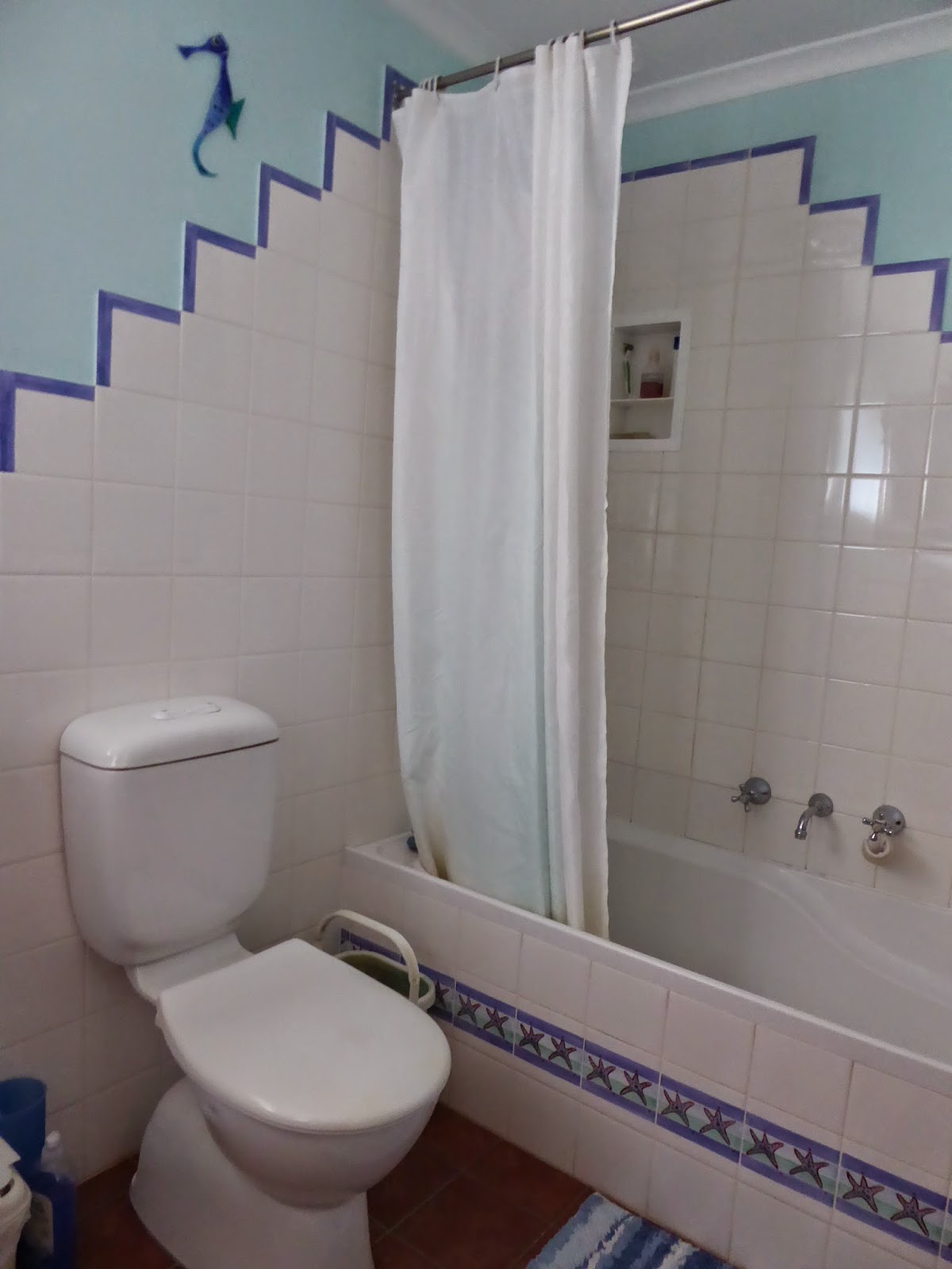
Design is about decision making, and designing the background is just as important as the motif in the foreground! In making my design decisions I wanted my backgrounds to be white & patched to reference white square tiles, and I wanted them to vary in placement & style to represent shadows on tiles & I wanted to use stitch & beads to represent the tracking of drips on those tiles. I felt these references would add depth to the pieces.


(Window drip patterns are very similar to those in the shower, but they are much easier to photograph!!!!!!!)

When all my essential decisions are made I transfer that information onto a working map.  I use the term 'map' instead of 'pattern', because my map shows me where I'm going!  Throughout the development of a piece of work I will add to the map, problem solve hiccups ON THE MAP & obviously...constantly refer to it!


The next phase includes constructing backgrounds, layering fabrics, machine stitching the design, cutting it back (I like that part!) & at last embellishing.


 The final part of the process is choosing an appropriate title.  At the time I was producing these pieces, I was also reading (& thoroughly enjoying) Elizabeth Gilbert's book 'The Signature Of All Things'.  This led me to think about the botanical latin names of plants, so I had a little explore on one of the language translator internet sites. I learnt that the latin word Plantaria  can mean hair cuttings! That was a good place to start!  Keeping the Sevi Proverb (shared at the start of this blog) in mind, I asked myself what word would define each of these blooms. The results were interesting for blonde, auburn, ebony, & brunette!

Therefore, let me introduce you to....Plantaria Hebenus, Plantaria Rutilus, Plantaria Brunneis and Plantaria Flava!!!!!!

*NOTE: Please respect that these photos are mine & of MY work & are not to be copied by YOU or anyone else without MY permission. Thank you! :-)


Sunday, 6 July 2014

Beauty in The BATHROOM!

In an ideal world, I would have liked to have hung each piece of this exhibition in their room groupings; bathroom, laundry & kitchen. That wasnt feasible in reality, but it IS here in blogland!!!! Therefore the first pieces we are going to explore in more depth are those inspired by hair-loss in the bathroom!

In most of our homes ensuites & bathrooms tend to be small spaces with few windows to see out of.  Being a tall person there is a lot of me to fold into that small space when I am trying to clean it!! Consequently, I find bathrooms particularly frustrating & claustrophobic , & I would rather be anywhere but there! In fact, my initial working title for the bathroom series was 'I'd Rather Be....'.  I would have a group of flower-like pieces & title them 'I'd Rather Be....In The Garden'! Then there would be 'I'd Rather Be...In The Sea' and 'I'd Rather Be...Dancing With Clouds'!! Mindfully observing the tracking of water drips, the reflections of light on tiles and the curvature of hair on those square tiles, helps distract me from the task at hand & has given me glimpses of beauty in the process.

I begin each new project with a mind-map.


Everything that comes to mind relating to the subject gets written down, whether it seems crazy or not.  I may not use everything I put on my mind-map, but it all contributes to the process!

The next step involves gathering my inspirational resources. If I have time, I draw the interesting hair contortions I find into a sketch book.

If I dont have time, I capture the hair design by sticking the adhesive side of a piece of contact (plastic film used for a protective covering on school exercise books) onto the tile & over the hair. It is then stuck onto a backing.


The accumulation of 'short & curlys' were recorded once a week before I removed them from sight!!


Some of the shapes and forms took on distinctive characters; flowers & jellyfish, while others were just interesting combinations of line. Gradually groupings emerged & ideas of presentation slowly formed.

Whilst this preparation was underway, I was also reading about the Spanish artist Joan Miro. He said;

"For me a form is never something abstract.  It is always a sign of something - always a man or bird or something else.  For me, painting is never form for form's sake."

All of these background stirrings were slowly brewing away in the creative crockpot of my mind! Excitement & feelings of anticipation are generally indicators that....it is time to start the DESIGN process!!!!!!


Friday, 4 July 2014

OPEN

GULP! My exhibition is now open to the public! Consequently it's open to scrutiny...open to interpretation...open to a WHOLE load of opinion! I have discovered that it is a very vulnerable feeling to have a body of work, & the concepts & thoughts behind it...EXPOSED to a wider audience.

In planning this exhibition I had decided to have a variety of styles of work on display, so that, hopefully, everyone would find something they liked! But...alas...I couldnt plan what the weather was going to be like!!

Last night the heavens opened & doused Adelaide in bucket loads of rain.  On top of that it was cold! However, instead of curling up in front of the fire a lot of very special people made the effort to come & celebrate the exhibition opening with us. I was overwhelmed with the turnout  as well as  grateful, touched & encouraged!

It was magical to see the work up in the gallery & to have that space full of people!

Thankfully people enjoyed my work & there were lots of smiles & chuckles!

I was particularly delighted to have my parents here from New Zealand!

I had kept them in the dark about what my work would be like, so it was all a surprise!! (hehehe!)

Julie Pritchard, Gallery M's Manager is, thankfully,  experienced at getting everyone's attention in preparation to hearing the opening speech!

I was privileged to have Madeleine Hedges give the opening address.

Aside from being an excellent speaker, she is my friend & has been a constant source of encouragement & insight from the moment I first shared the concept for this exhibition with her.


She had everyone's attention from the start!

It was a good night & a great way to start an exhibition.

Cheers!

(Note: I have plans to share a video of Madeleine's opening speech, but due to technical difficulties...it will have to wait!)


Tuesday, 1 July 2014

YOU'RE invited!


LOCATION,LOCATION,LOCATION!

Adelaide is blessed with a variety of galleries & exhibition spaces. Some of those venues suit different styles of art more than others. Soooooooooooooooooooo, WHY did I choose to hold my exhibition at Gallery M?


Aside from being a funky looking venue, Gallery M is located with a good proximity to a ready made audience! Situated on one side of the massive car park that provides a service for those flocking into Marion Shopping Complex, Gallery M shares a building with a library & a community centre.  From the steps of the library you can see right into the Gallery!  Across the road is a modern olympic sized swimming pool centre & also a gi-normous Bunnings Hardware store. In short....its a great location & easy to access for LOTS of people!

The space itself is also a winner for me. High ceilings with good lighting & the ability to suspend double-sided artworks, coupled with moveable internal walls, makes this a flexible space. Consequently, the space can be split up into smaller exhibition areas, which works for me!  My exhibition is in only a quarter of the gallery. There are two other exhibitions on at the same time; 'Transformation-Improvisatiopn' by Bev Bills & Katharina Urban have half the gallery, and Alison Main is presenting 'Lost Horizon' in the other quarter gallery.

I had two wonderful friends help me hang the exhibition in my quarter of Gallery M yesterday.  Here's a sneak peek....

The decal sign was made by Ted Turner Signs here in Adelaide. They were so helpful & even delivered the sign to the Gallery for me!


Hanging irregular shapes takes a great deal of time & patience...but is worth it in the end!


28 small pieces to be presented in a grid seemed a good idea at the time....!

And the tool we couldnt have done without, aside from a ladder & masking tape....the SPIRIT-LEVEL!!

More information about Gallery M can be found at www.gallerym.net.au